10 dashboards with +30 different types of graphs and charts designed
Sold with 'La Repubblica,' a newspaper with a daily circulation of +260k copies
Project Language
Italian
My roleI independently managed the design of the dashboards, starting from the text and data delivered by the journalists to their final completion.
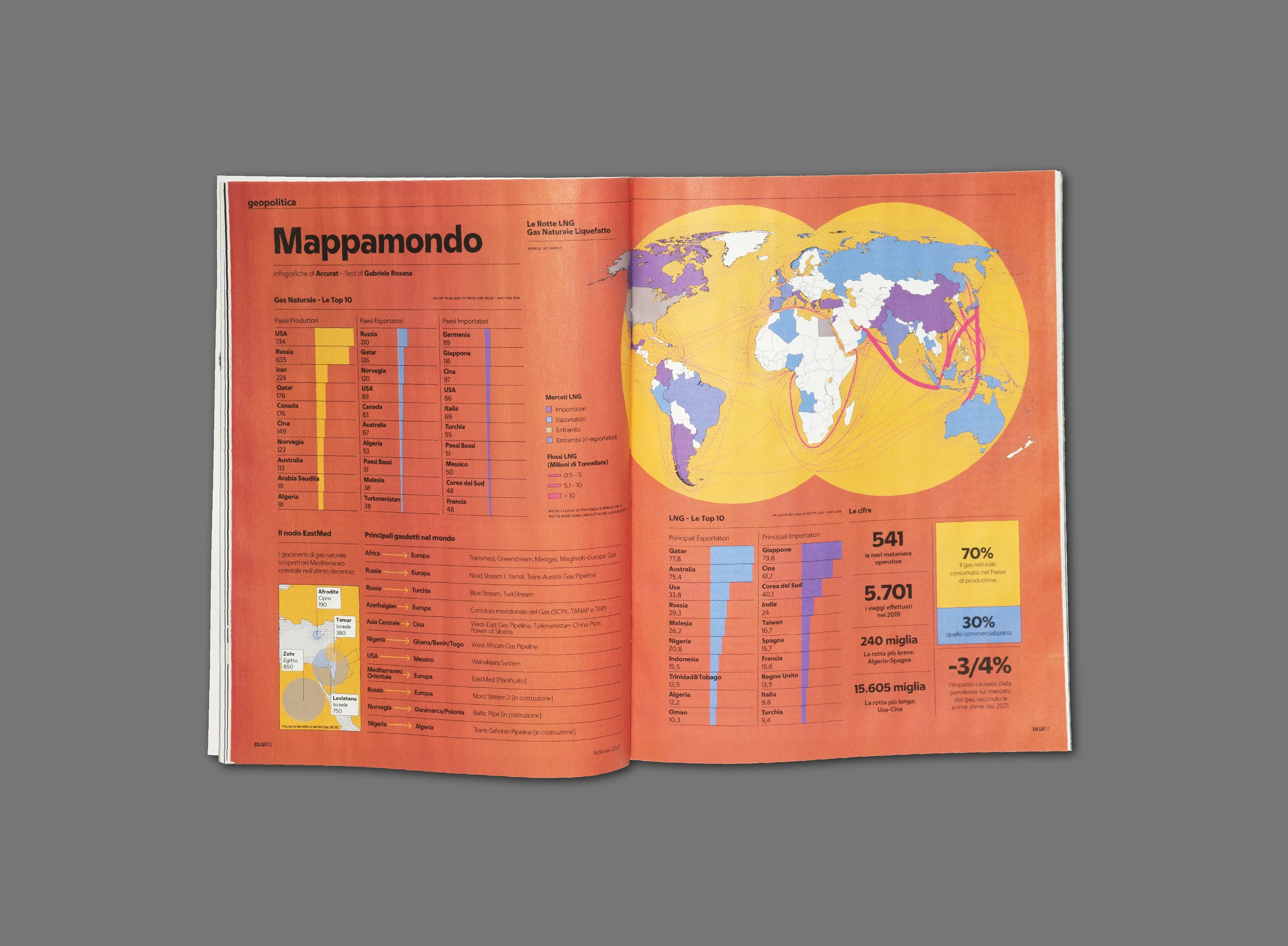
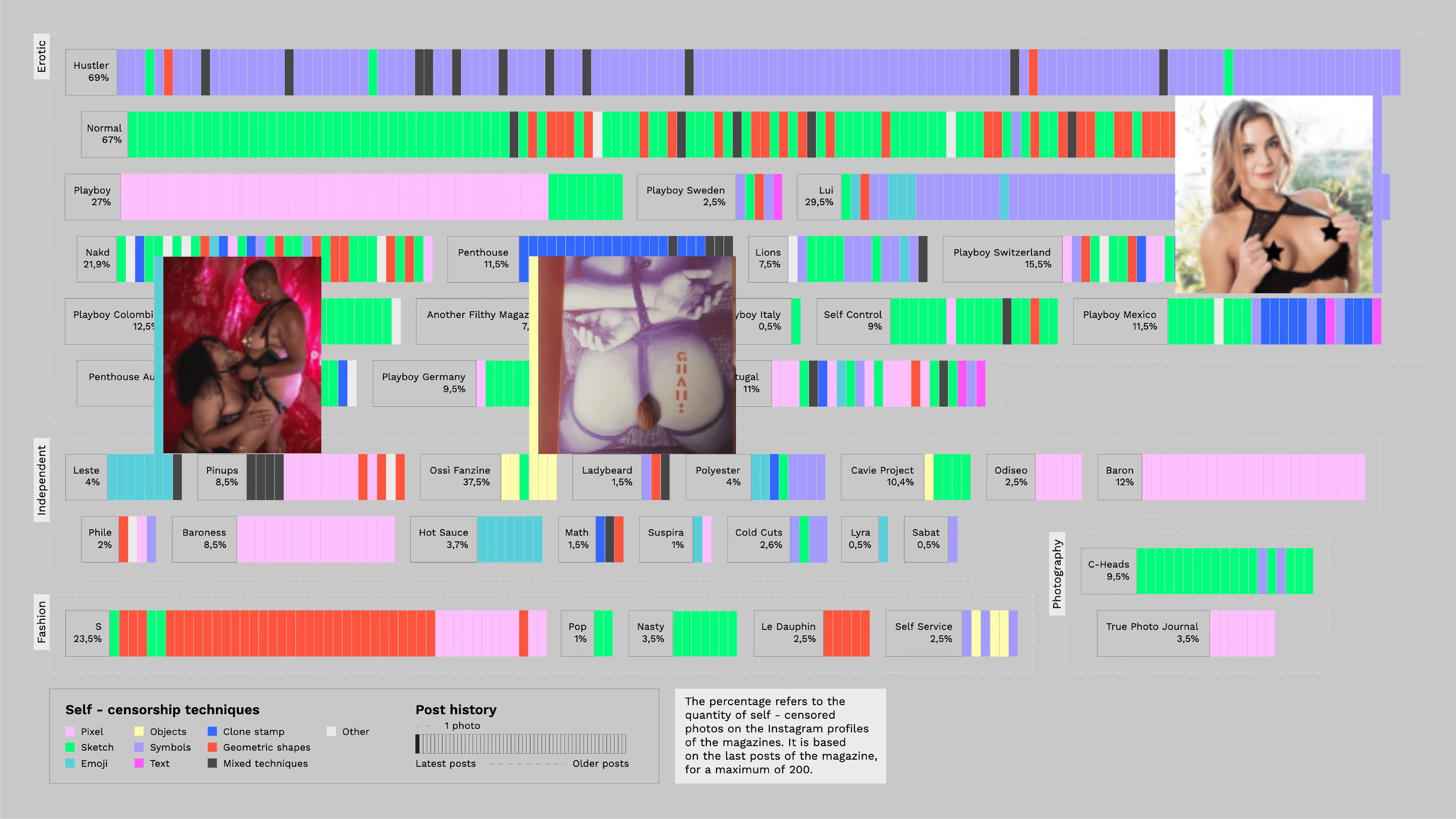
↑ A dashboard I designed for "Dlui" focusing on gas pipelines.
Context
GEDI Gruppo Editoriale is an Italian multimedia company involved in printing. I was tasked with designing dashboards and infographic content for special printed inserts of La Repubblica, one of Italy's largest daily newspapers. These inserts included “Salute,” focused on health-related news, research, and updates; “Green and Blue,” addressing climate, biodiversity, energy, mobility, economy, and technology; “Cibo,” centered on food; and “DLui,” tailored for men.
The visual identity and guidelines were already well-established, presenting the challenge of creating visually diverse and appealing content within these parameters.
↑ Two different publications featuring their respective color schemes.
Goal
To design informative and neat dashboards within a tight weekly schedule, providing a wide range of readers with clear overviews of specific topics.
Process
- Laid out the content in a two-page dashboard following the publication grid.
- Drafted graphs and charts quickly to get early feedback.
- Designed final visualizations to be accurate and color-balanced within the entire dashboard.
- Prepared the document for printing.
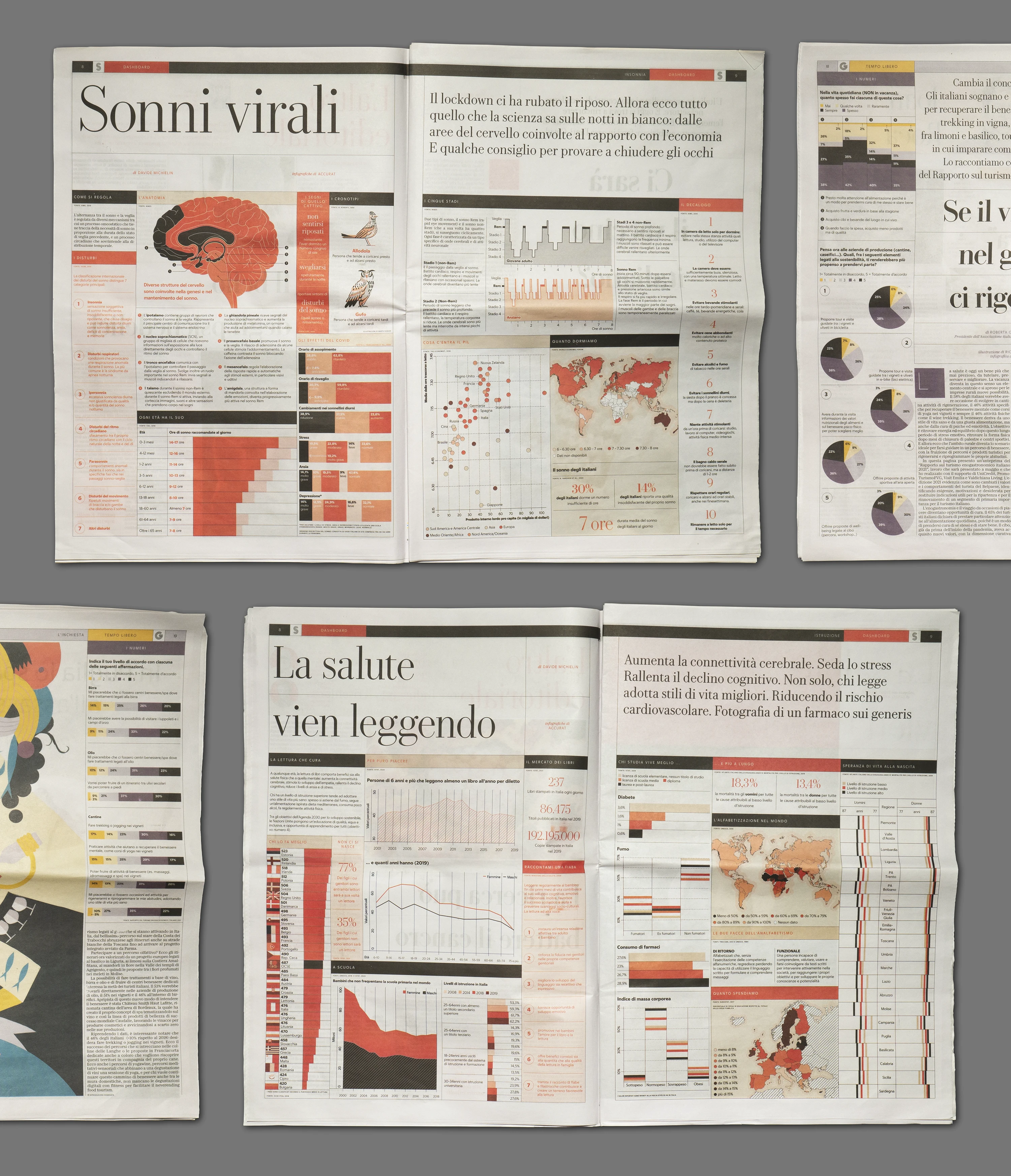
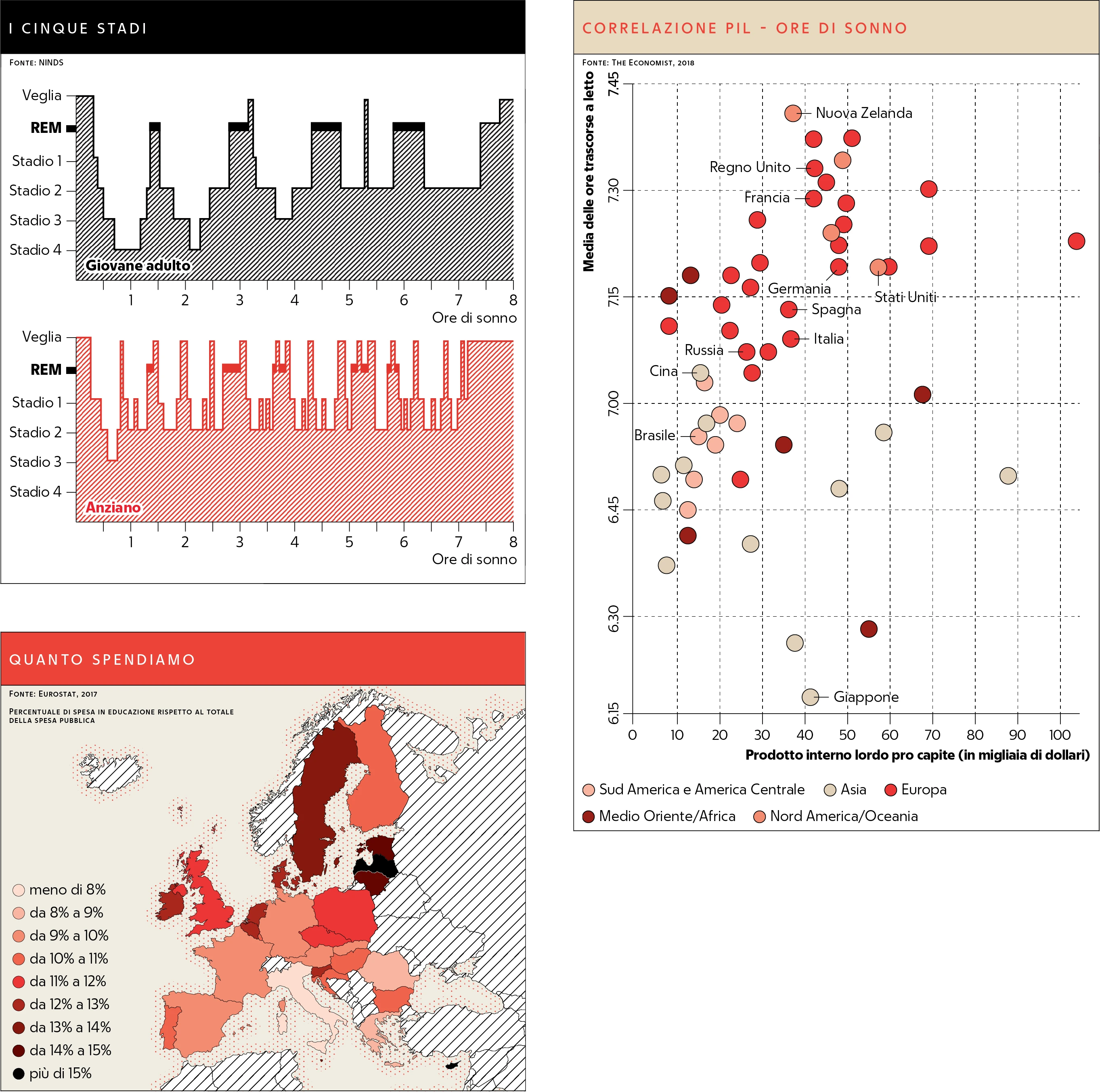
↑ Some visualizations I designed for “Salute.”
Each dashboard project began with a newspaper journalist providing the content, including data and text, for the issue. Following the newspaper's established graphic guidelines for visual consistency, I created novel graphs, visualizations, and graphics, ensuring variety and engagement.
↑ Some visualizations I designed for “Green and Blue” and “Salute.”
Outcome
The final dashboards were visually engaging and provided readers weekly with clear, concise information on a variety of topics.
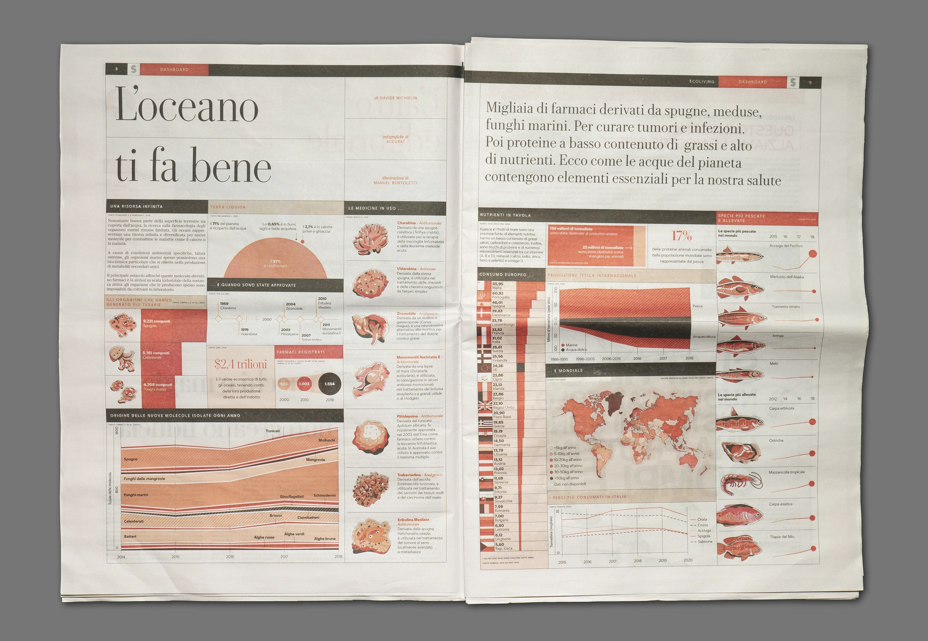
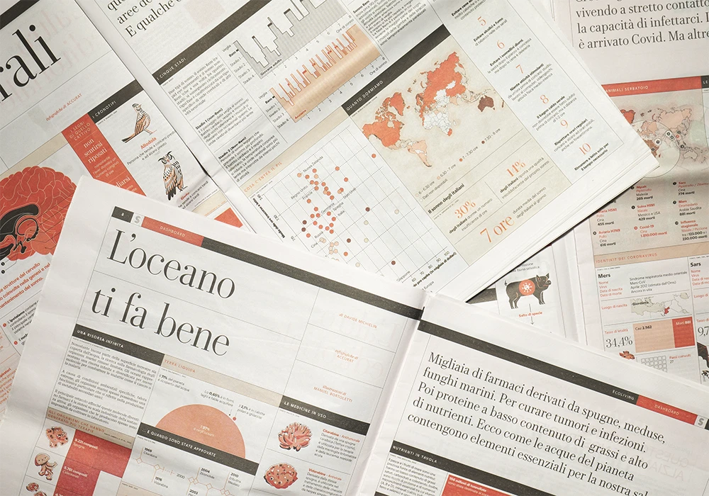
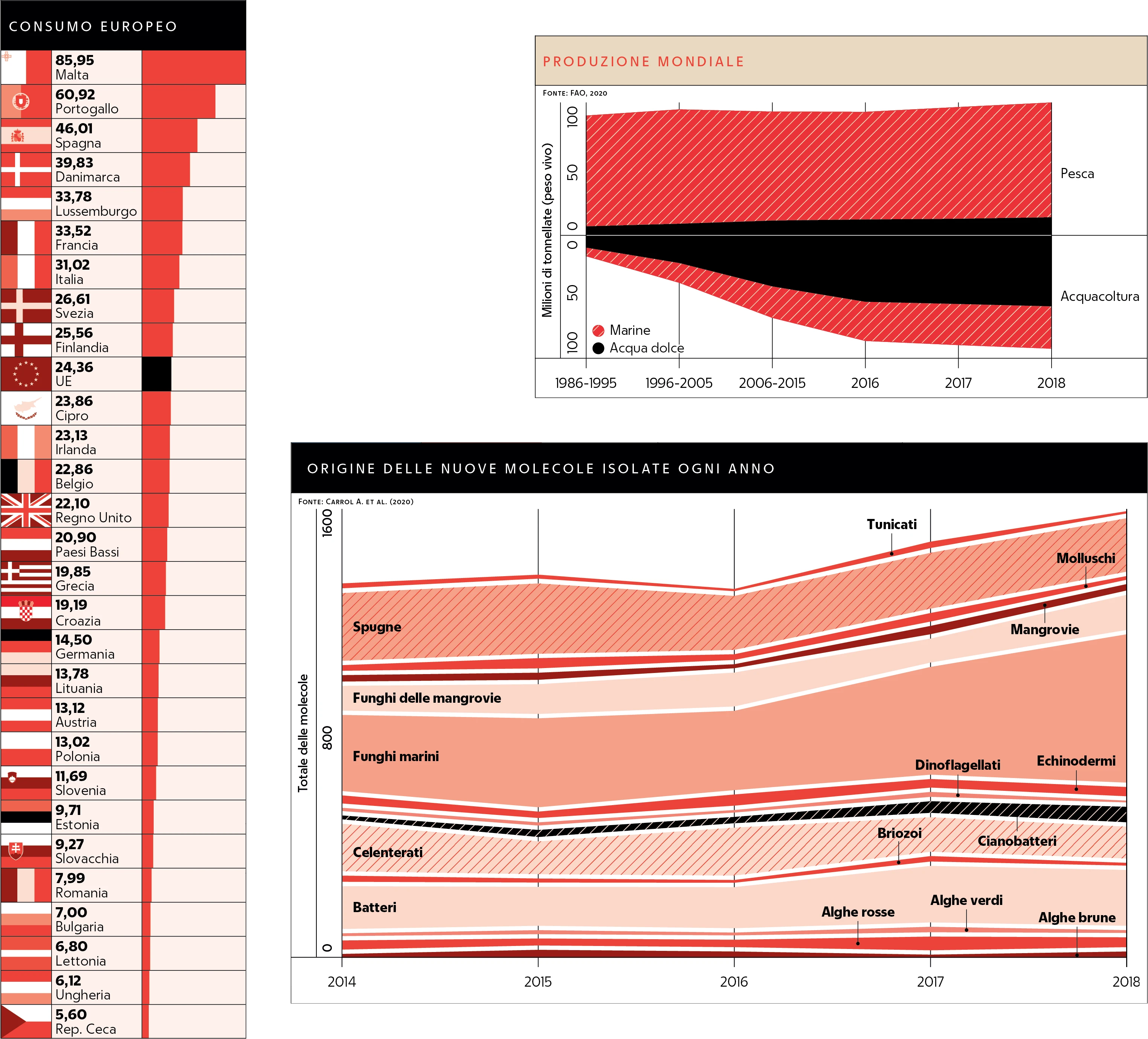
↑ I explored the theme of the ocean in issue #6 of "Salute.”
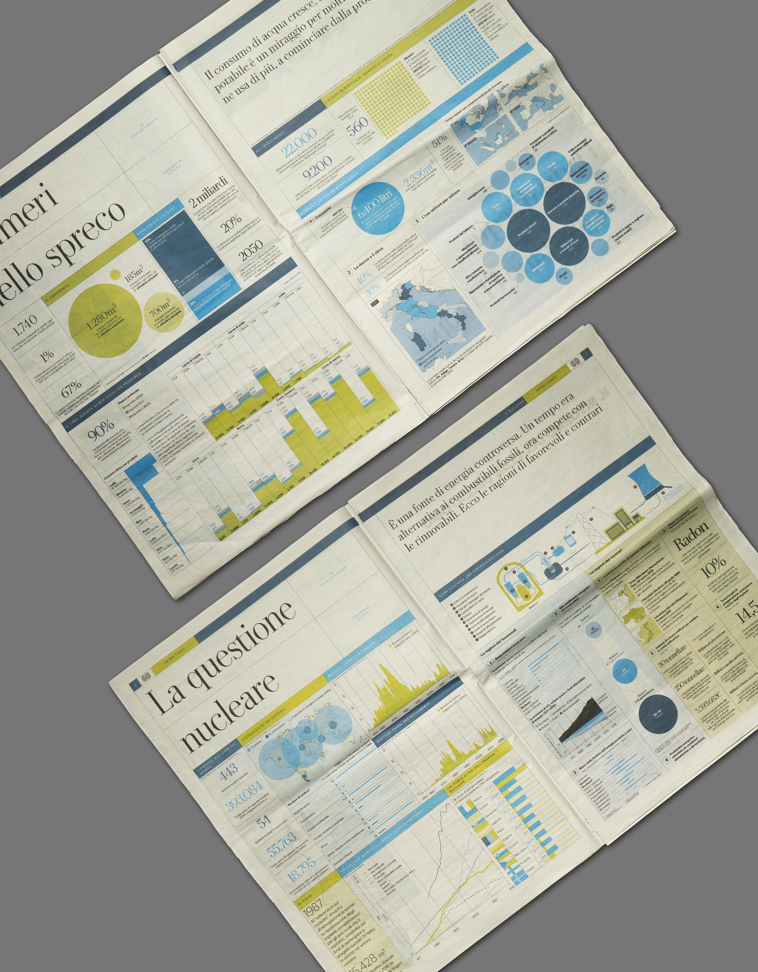
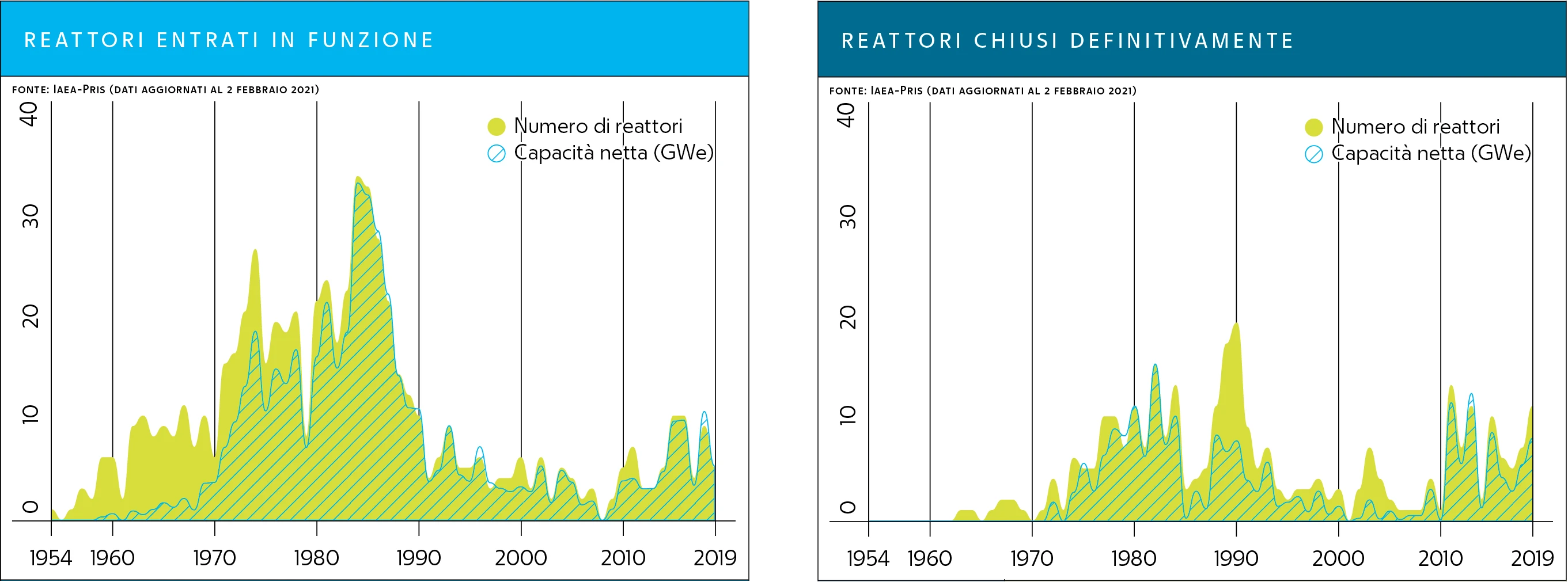
↑ Two dashboards I developed for “Green and Blue” Issue #6 addresses water consumption, while Issue #5 focuses on nuclear energy.
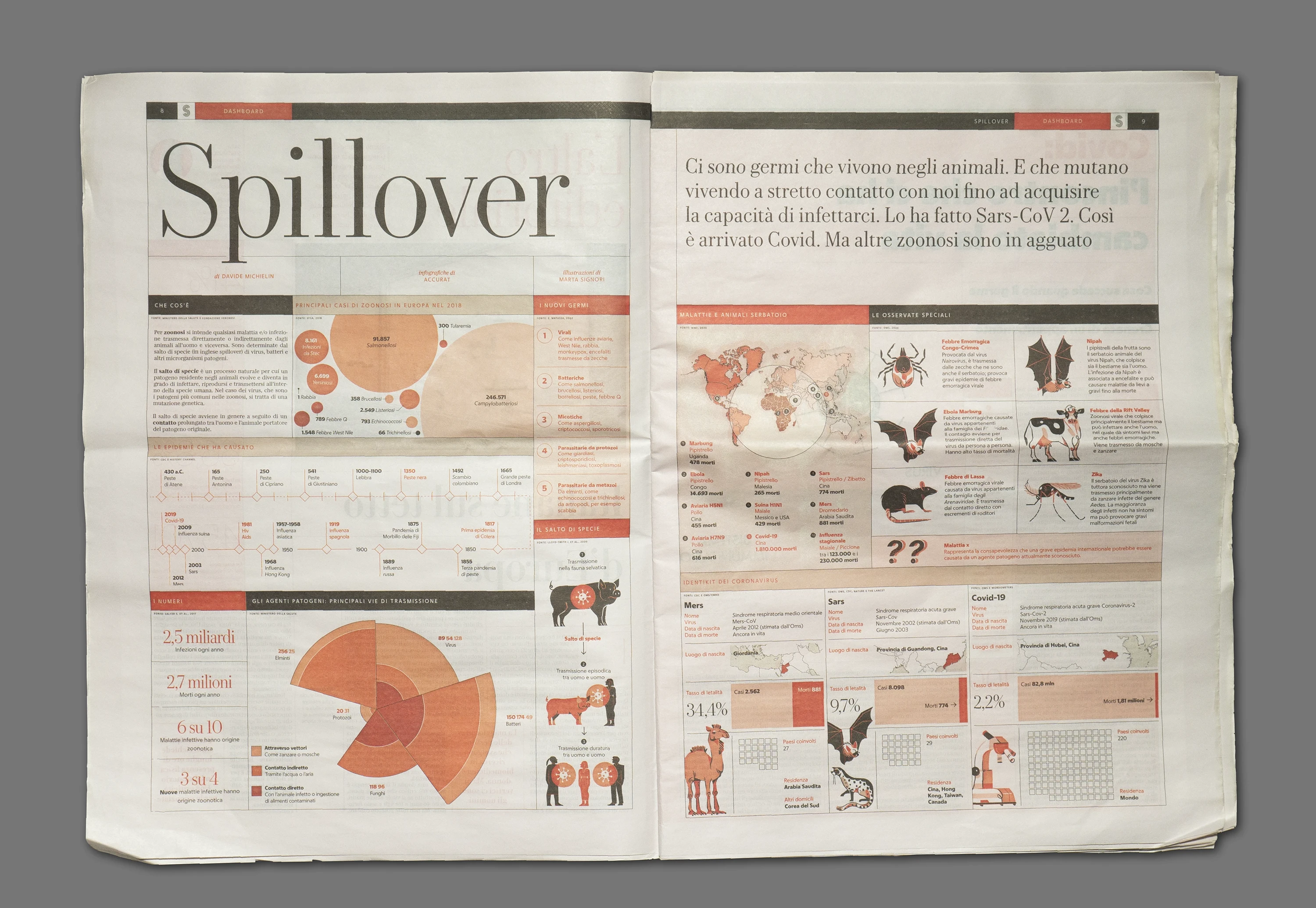
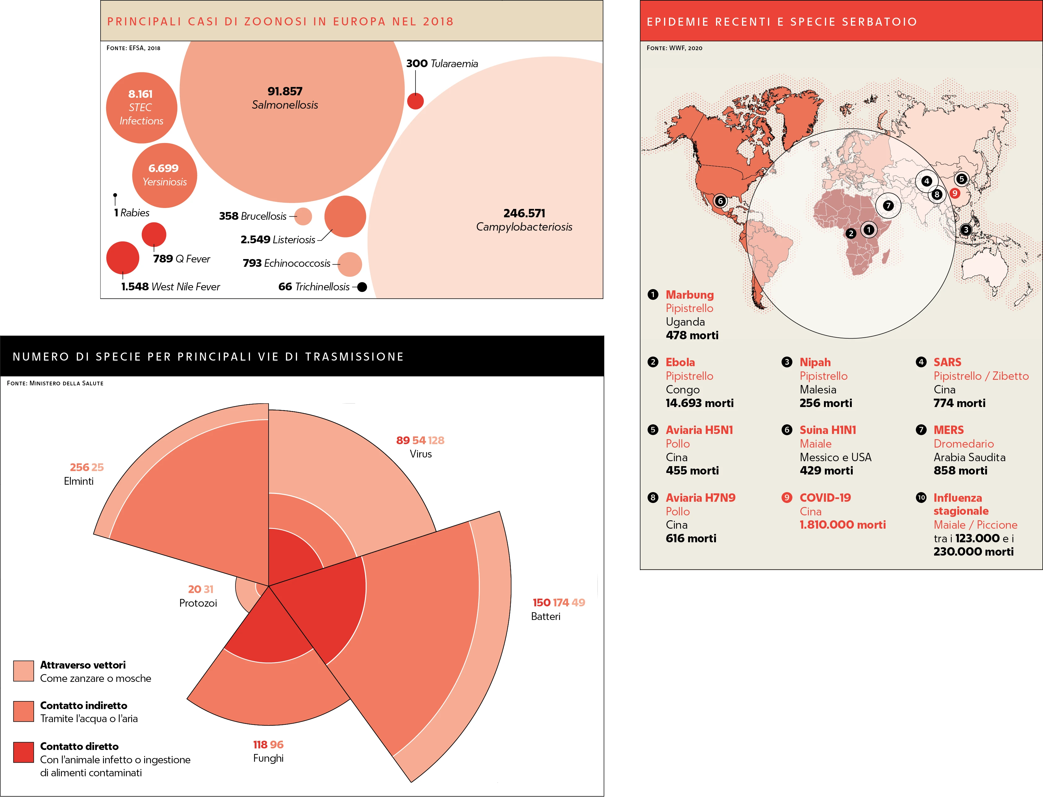
↑ The dashboard I designed for issue #5 of "Salute" explored the transmission of viruses from animals to humans.
The final dashboards were visually engaging and provided readers weekly with clear, concise information on a variety of topics.
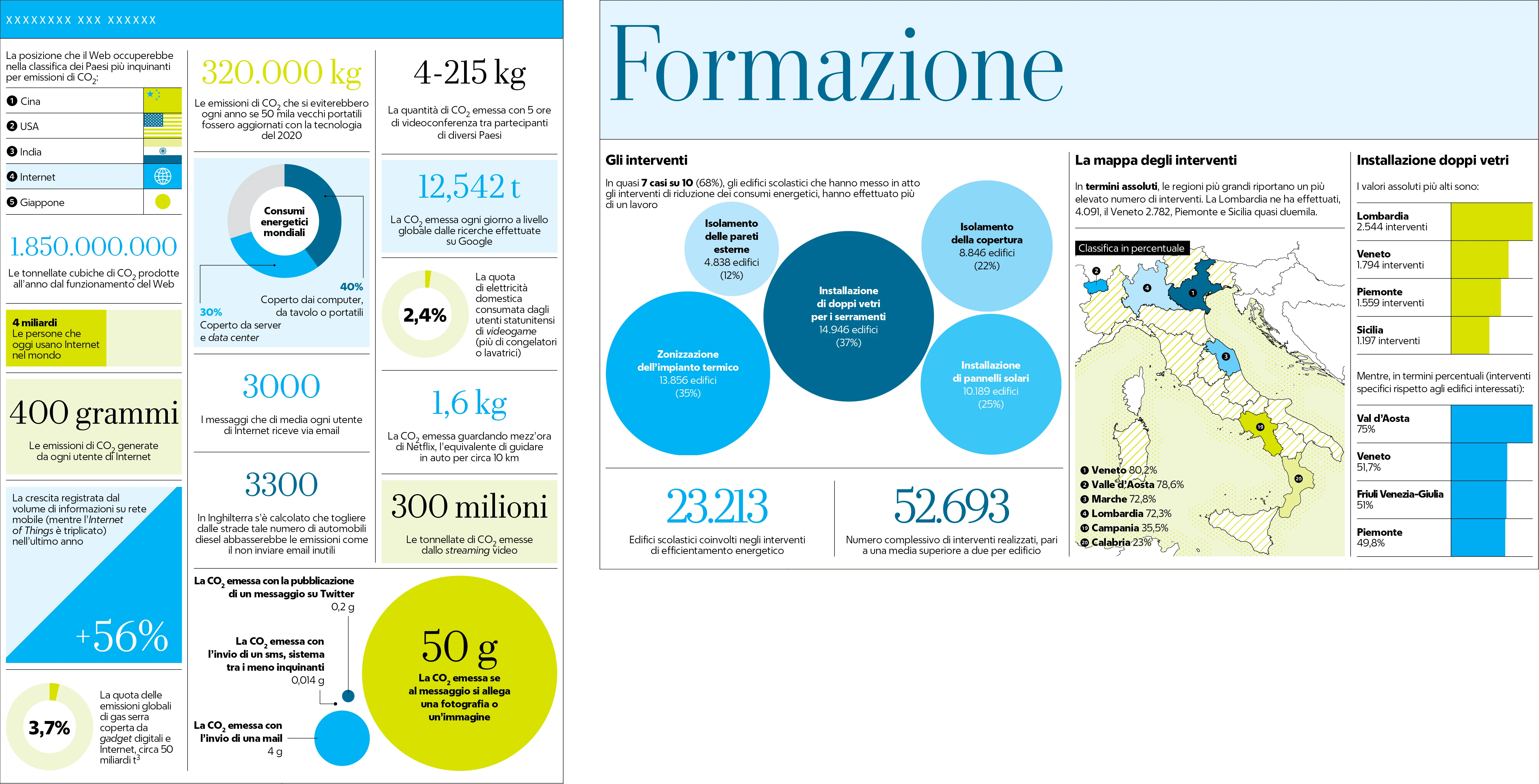
↑ I created two smaller inserts for issue #7 of “Green and Blue”: one on energy efficiency interventions in school buildings and another on CO2 emissions from internet use.
Result
The dashboards successfully enhanced the publications by offering readers a visually appealing and informative way to understand complex topics. The clear and engaging infographics helped La Repubblica maintain its reputation for high-quality journalism and visual storytelling.
Skills: Data Visualization Design, Information Design, Graphic Design, Editorial Design