Received a plaque at the 2021 Budget Oscars
161 pages and +50 visualizations
Published on the Egyptian Museum’s website and shared on its channels
Project Language
Italian
My role
I contributed to the early conceptual and creative stages by collecting references, experimenting with styles, and outlining initial visual concepts. I designed timeline pages and drafted various visualizations to set the foundation for the final ones.
Context
The Egyptian Museum of Turin, specializing in Egyptian archaeology and anthropology, commissioned us to design its inaugural integrated report. The museum aimed to create an innovative document that highlights its value-generating activities and provides a comprehensive view of its operations, from research to social inclusion.
Goal
To produce a report that merges quantitative and qualitative aspects of the museum’s activities, emphasizing elements that determine its value.
Process
- Collected visual references to establish a unique and fitting aesthetic.
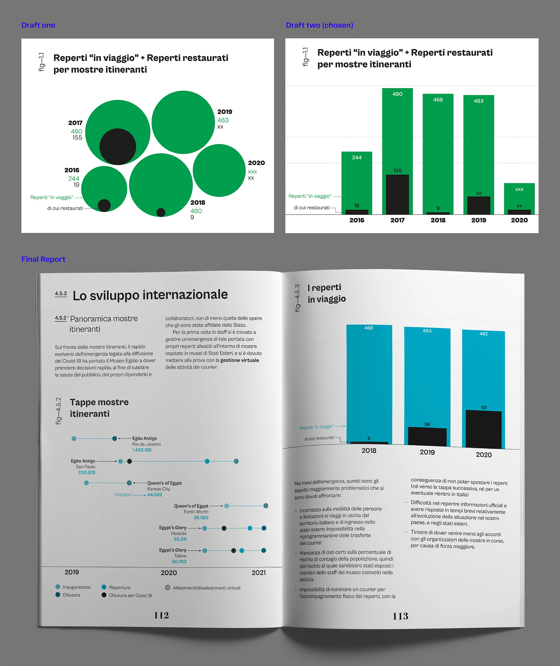
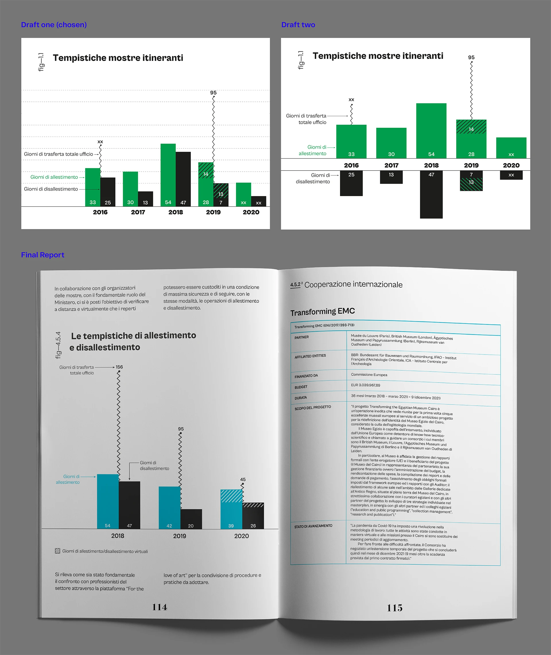
- Created rough visualizations to define the final design approach.
- Experimented with various charts and graphs to see how the aesthetic could be applied effectively.
- Developed visual guidelines for consistent future visualizations.
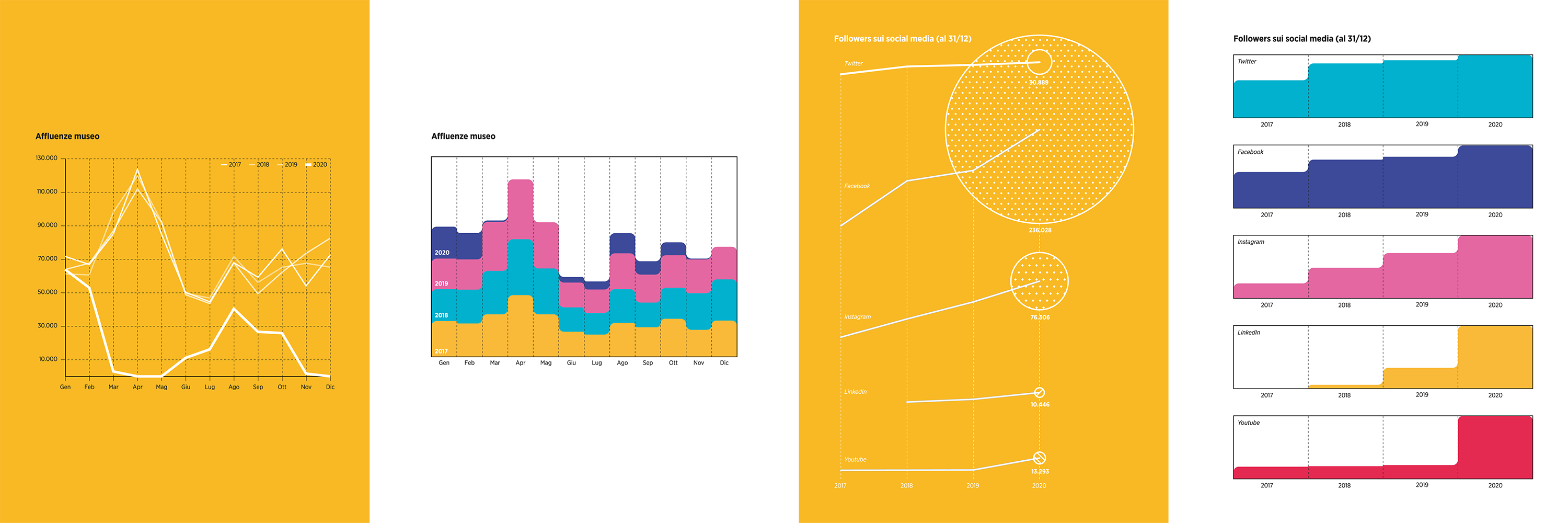
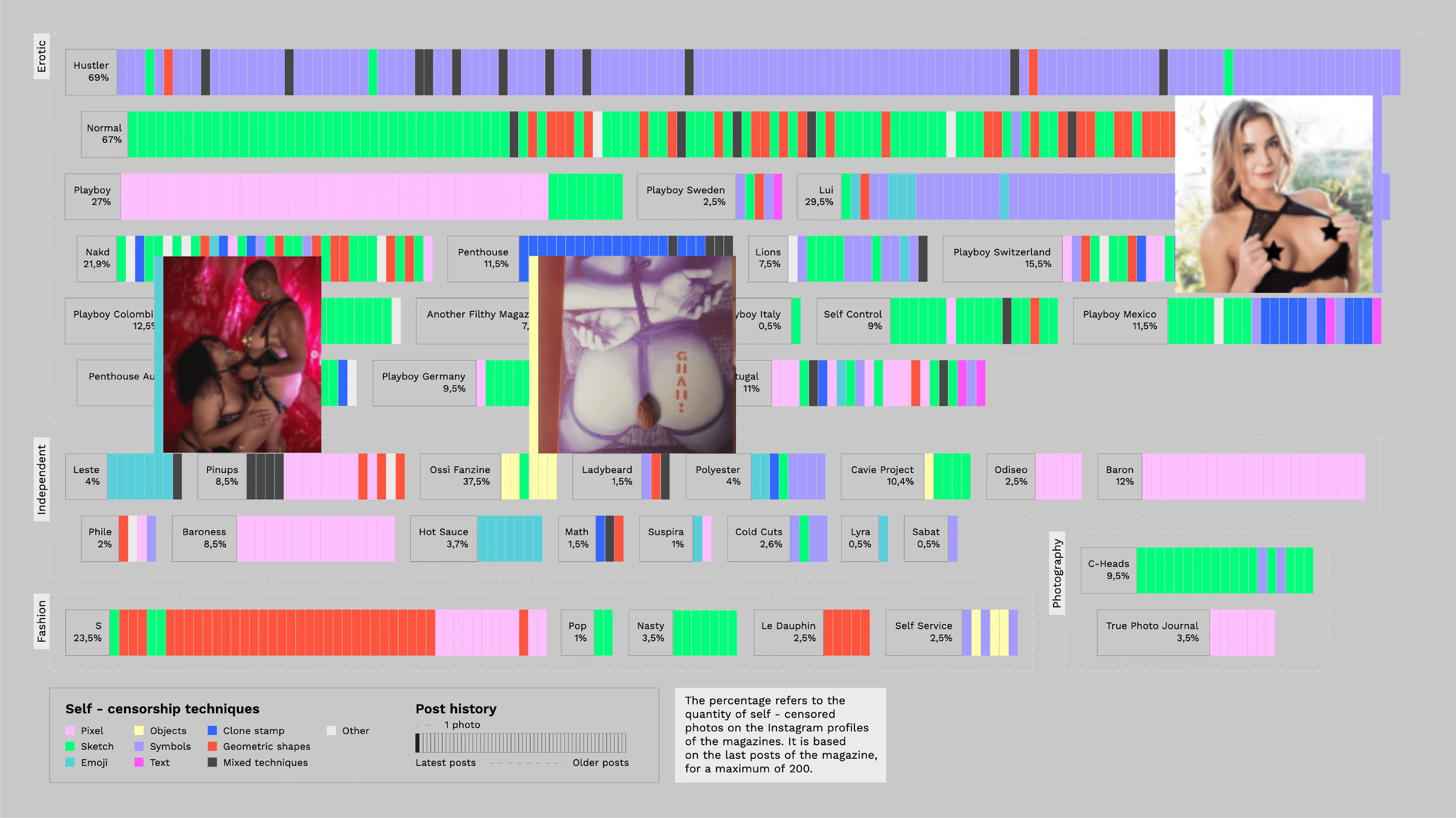
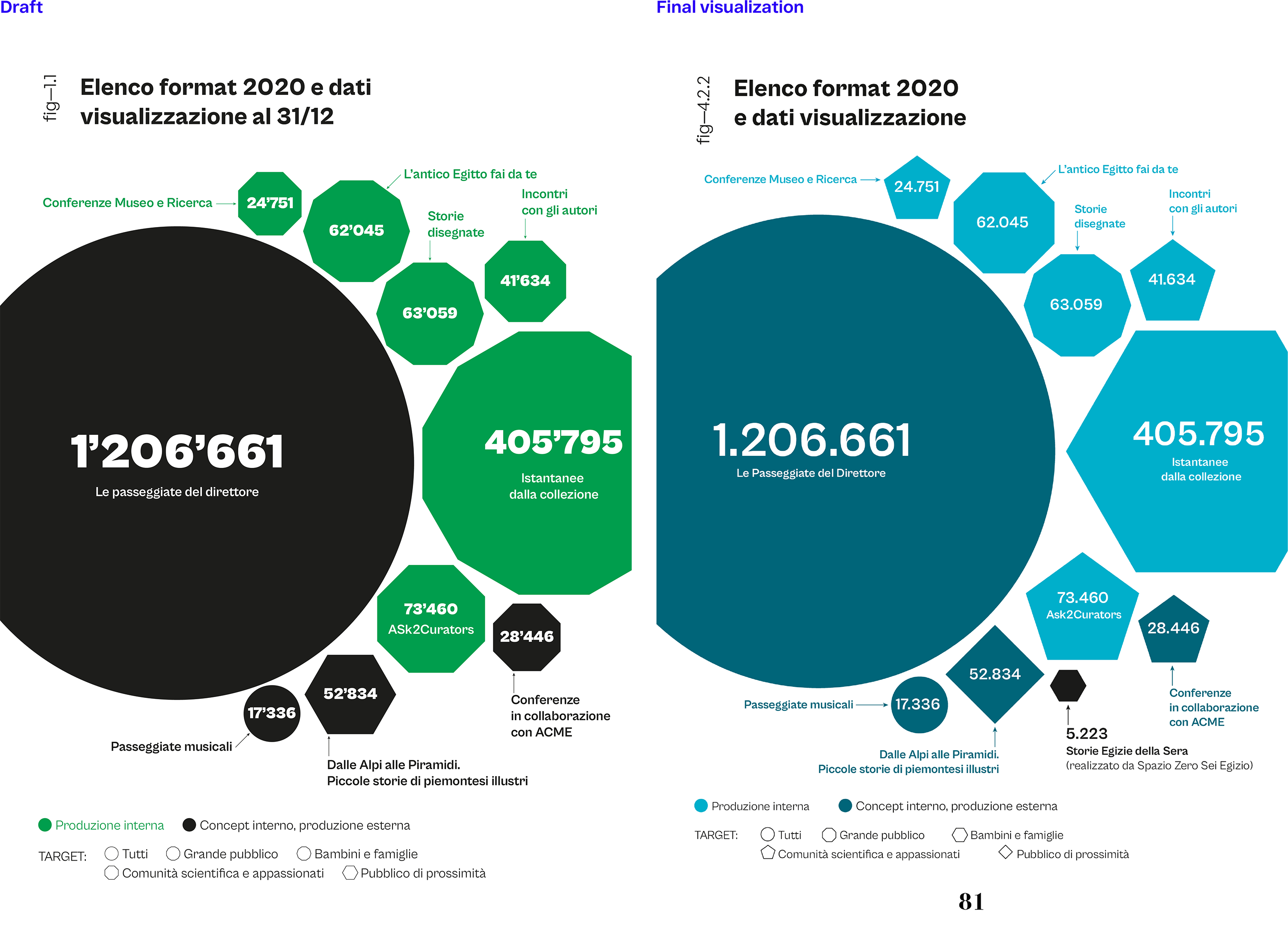
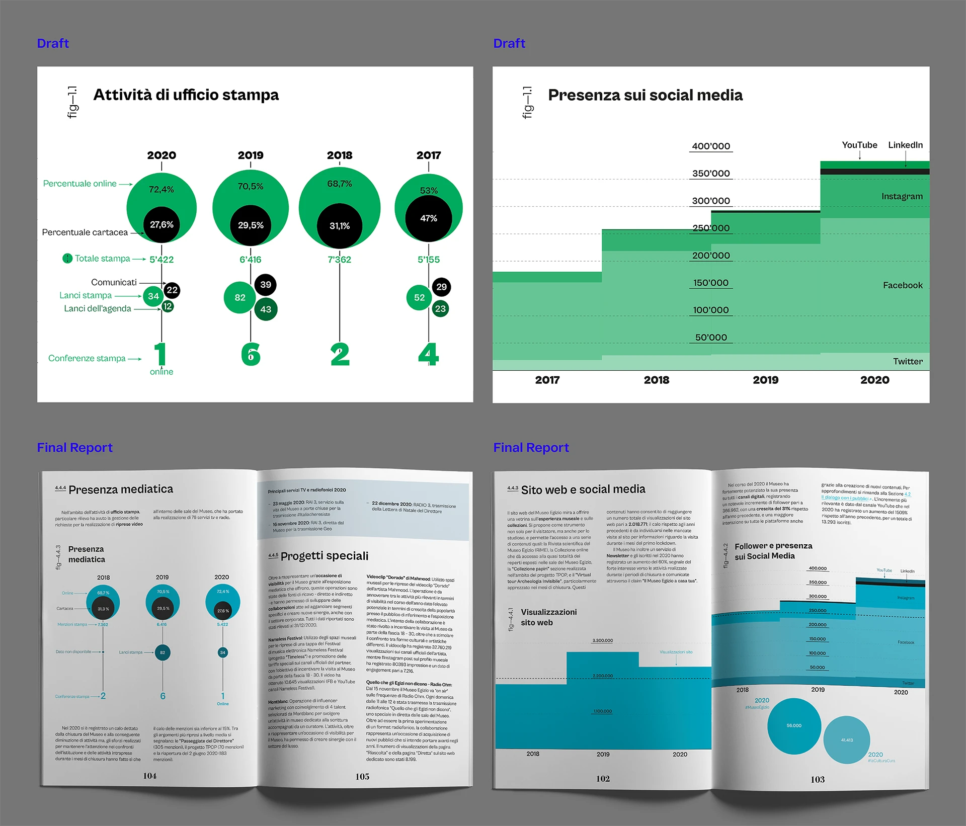
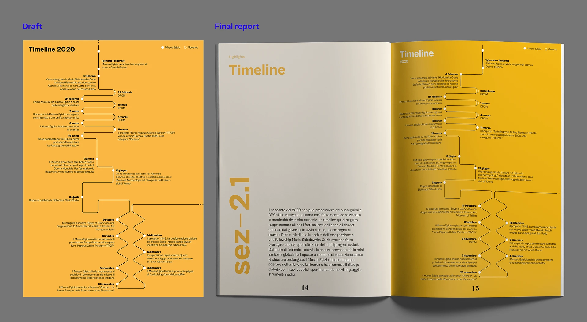
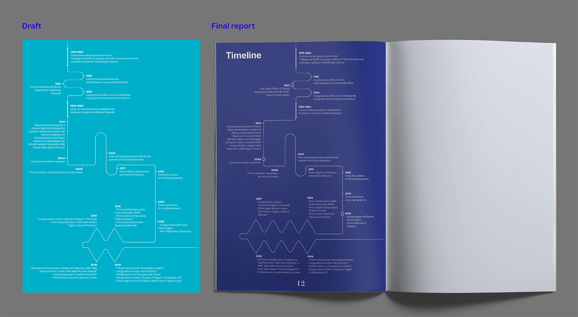
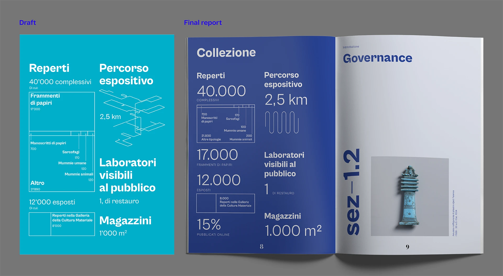
↑ Some of the very first drafts I created to experiment with different styles before choosing the final one.
I started with thorough visual research to lay a foundation that would inspire and guide our design choices, experimenting with gradients and unconventional graphical styles. Ultimately, we settled on a compact style using solid colors, geometric shapes, and full or nearly full-page visualizations.
Outcome
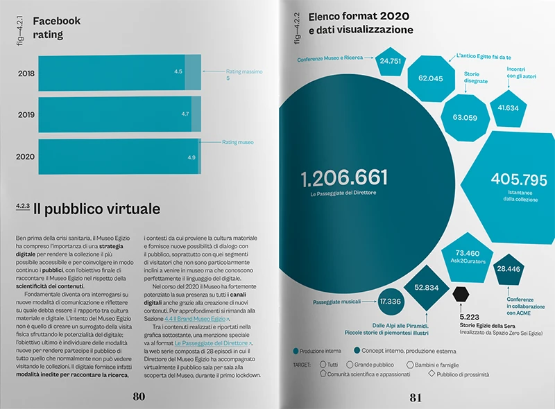
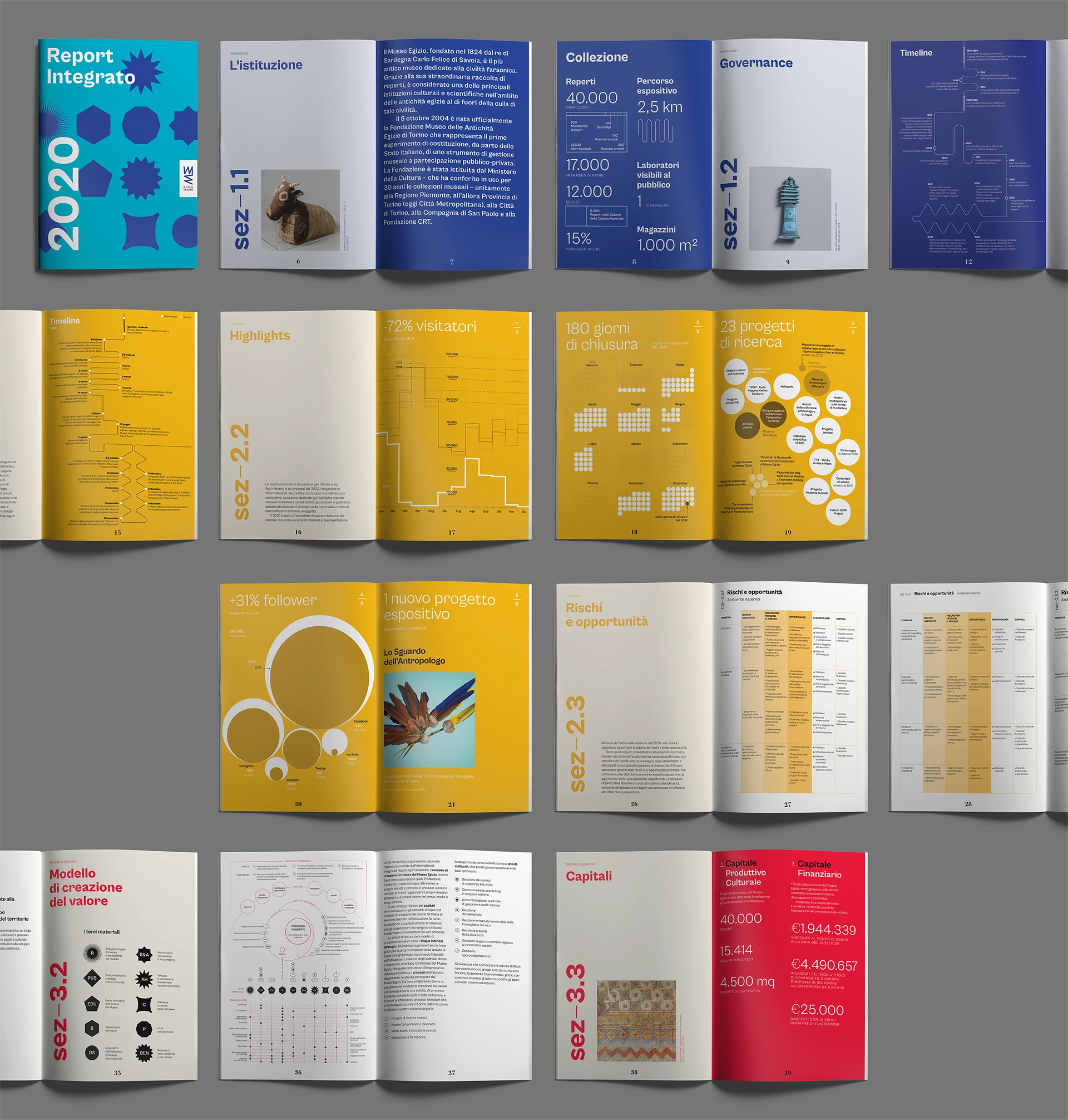
We focused on creating impactful, easily readable visualizations to effectively communicate the museum’s contributions. To enhance readability, we often incorporated legends directly within the infographics and used a limited color palette to maintain simplicity and effectiveness.
The value creation model was designed as the core of the report, guiding readers through the subsequent sections that delve into different material topics.
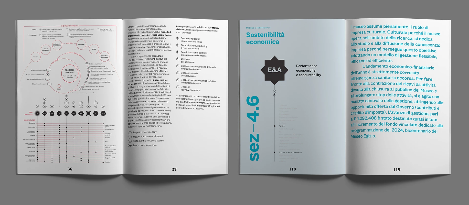
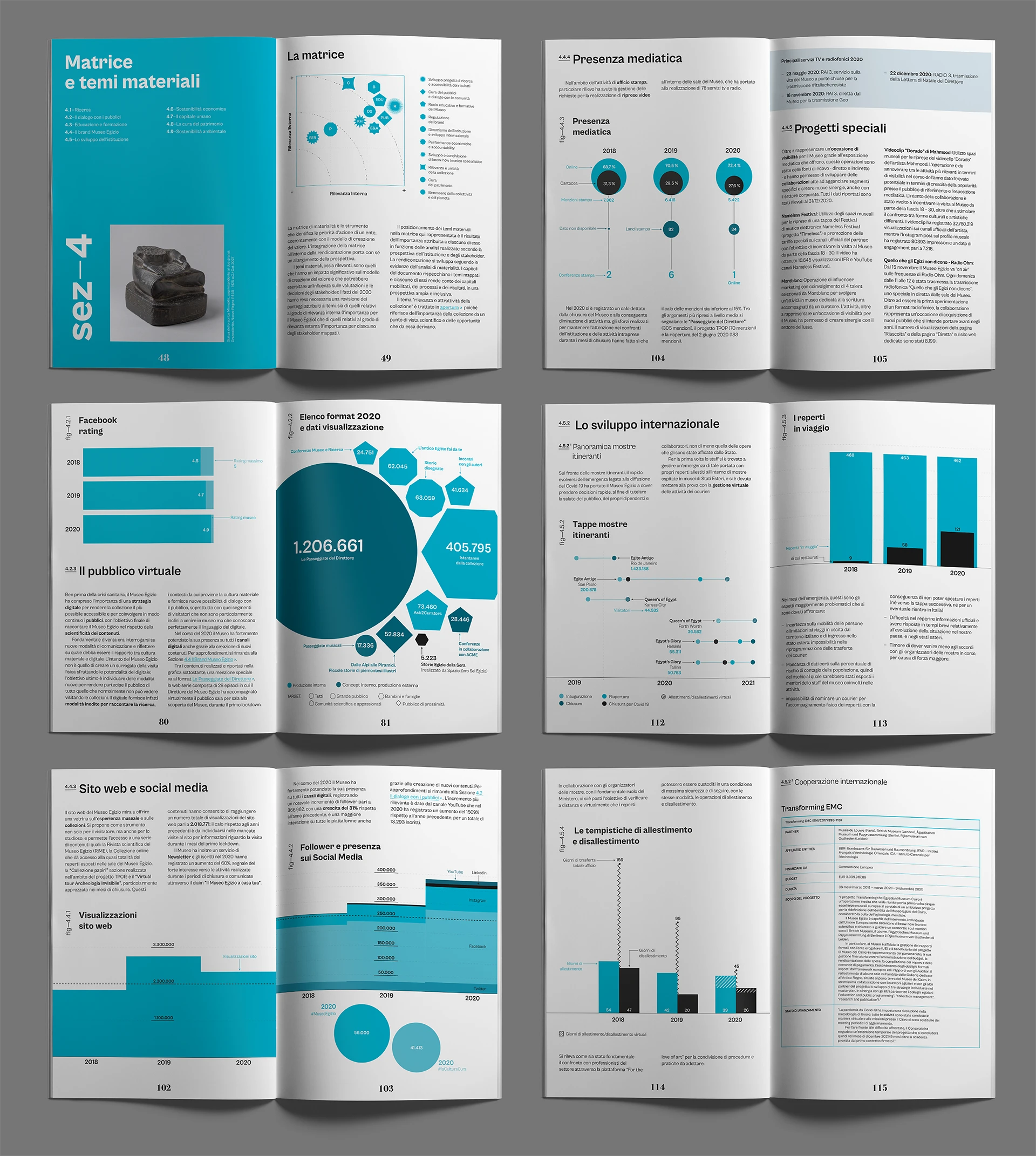
The report was divided into four sections, each characterized by a specific color from the museum’s brand identity. These colors were used consistently in graphic elements within each section to enhance visual clarity and strong characterization, aiding in navigation and understanding.
Result
The integrated report successfully highlights the Egyptian Museum’s diverse activities and contributions, from archaeological research to social initiatives. It stands as a testament to the museum’s commitment to transparency and communication, providing stakeholders with a clear understanding of its value and impact. Such positive feedback prompted the museum to produce a printed version of the document as well.
Skills: Data Visualization Design, Information Design, Graphic Design, Editorial Design
Team: Marco Bernardi, Davide Grimoldi, Alessandro Zotta